Euroleague Basketball Unveil 2013 Final Four Event Logo
March 6, 2013
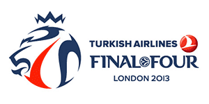
Euroleague Basketball have unveiled their new logo for their flagship event, the 2013 Turkish Airlines Euroleague Final Four, to be held from May 10 to 12 at The O2 in London.
The logo has been created by the international award-winning Greek agency Designers United, creators of three previous Final Four logos – for Athens in 2007, Berlin in 2009 and Paris in 2010. The 2013 Turkish Airlines Euroleague Final Four logo is inspired by London’s DNA as a modern and edgy city that conserves a hint of tradition, which is reflected by the juxtaposition of a modern, graffiti-inspired “lion-ball” topped with a classic crown.
The lion is one of the main symbols of London and of the United Kingdom. It stands for bravery, passion, courage, honor, leadership, strength and authority. It has been a common emblem for England throughout history and is featured on the royal coat of arms, creating an association which in branding terms is translated into prestige.
England has a strong link with the image of the crown, an emblem for the strong tradition at the heart of London’s identity. The crown also ties in perfectly with what will happen in London, where the Turkish Airlines Euroleague champions will become the new kings of European basketball on May 12 at The O2.
Red and blue are known worldwide for being national colors of the UK, commonly associated with the country’s flag, the Union Jack. The red line dividing the lion-ball in two symbolizes the River Thames, which also divides the city of London into two parts.