
England Netball Rebrand Logo And Launch 10-Year ‘Adventure Strategy’
November 25, 2021
England Netball (EN) is excited to introduce our new look, creating a fresh, confident and friendly brand identity with a new logo, to support the launch of EN’s new 10-year ‘Adventure Strategy’.
The ‘Adventure Strategy’ outlines the intention to accelerate the development and growth of the game at every level, from grassroots to the elite, elevating the visibility of the sport and leading a movement to impact lives on and beyond the court.
At the heart of its purpose, England Netball, with its proud and unique female foundations, will remain dedicated to increasing opportunities for women and girls to play the game as a priority, working tirelessly to address the gender participation gap in sport that has widened since the global pandemic. Underpinned by years of engaging with and delivering netball for female communities, the organisation pledges to understand, support and nurture women and girls more deeply at every life stage, at every age.
The organisation is also committed to opening up the sport to new audiences in every community, so netball better represents the rich diversity of the country it proudly represents, and ensures the sport continues to evolve and adapt to thrive in the future, helping to create a truly inclusive sport for all where everyone can belong, flourish and soar.
The recent partnership announcement with England Men’s and Mixed Netball Association (EMMNA) to help develop and grow male participation in the game, supports this commitment as England Netball pledges to promote difference and embrace the opportunity to make the sport a possibility within everyone’s reach.
Transforming netball for children and young people is a strategic priority to protect the future of the sport. Working with schools and policy makers to extend physical literacy within, and after the school day with a focus on netball specific provision will pave the way for greater community participation. The organisation will accelerate the expansion of its Bee Netball programme for young children, whilst supporting teens and young women to stay in the game to keep them physically active and in the game for life.
The elite game is in focus too, with the ambition for the Vitality Roses to be the best female sports team in the world, supporting the national team to consistently win on the world stage, with an outstanding talent pathway in place to fuel sustainable successes on court, and setting new standards for netball. The professionalisation of the game over the next decade is a priority, focusing on growing world-leading international and domestic competitions and events, and creating more careers in the sport.
Grounded in feedback from the Netball Family, with over 3,000 members and stakeholders consulted as part of the strategic process to understand what they wanted netball to ‘look like’ in 2031, the plan is aspirational and ambitious and sees the organisation pledge to continue to be a trailblazer for women’s sport as it embarks on its new adventure.
To help realise the purpose there are six ‘destinations’ in the strategy, underpinned by 14 ‘game-changers’ that form the actions the organisation will take to bring it to life. A ‘moral compass’ provides a framework of beliefs and values designed to hold the organisation true to its purpose, with seven distinctive ideals that will help guide the workforce, volunteer community, partners and wider Netball Family on the journey.
The strategy is supported by a fresh new look for England Netball, with a new brand identity and logo. Inspired by insights and feedback from the Netball Family and beyond, England Netball has created a confident yet friendly brand identity to clothe them for their journey ahead.
Fran Connolly, CEO of England Netball, said: “This is an exciting day for the organisation as we launch our new ‘Adventure Strategy’, which is driven by a clear and unwavering purpose to inspire growth across the whole sport.
“Going into next year, a year like no other for netball in this country, we will not only be preparing to defend our Commonwealth Games Gold on home soil, but we will also begin to accelerate this ambitious and game changing plan for the sport for the next decade and beyond.
“It is our goal that by 2031 netball in England offers a true game for life, with an offer for all communities supported at every life stage and every life age, to be the sport of choice for women and girls for years to come.
“We also want to see the professional environments and structures in place in the elite game to top the world rankings in every sense and provide many more careers in the sport.
“We have taken learnings from the last decade to inform the next, and I want to thank the Netball Family for helping to co-create our adventure, with each and every element of the strategy rooted in feedback and insight from our communities.
“As an organisation we are setting out on a journey to realise our goals and continue to reimagine and reinvent ourselves to stay relevant to communities, connecting with our audiences more powerfully than ever before, to grow and develop the game at all levels for years to come.”
Where it all began
Conversations surrounding EN’s re-brand began after the Vitality Roses won gold at the Commonwealth Games in 2018. This moment signified a fantastic point to utilise the sport’s momentum and build a stronger platform and identity for EN across the world.
In March 2019, EN conducted research with several different groups of people inside and outside of the Netball Family to help develop our new identity and how it clothes us for the next decade.
We asked people to take a good look at our logo and identity and tell us what it meant to them.
The rebrand brief
Once we carried out the research and collated the results, we thought very hard about what we wanted our new brand identity to be and how we wanted to be portrayed internally and externally.
We wanted to be different and stand out from other governing bodies and sporting organisations. We wanted to have a premium look and feel, whilst ensuring we appeal to all ages, and be brave and bold, whilst being true to ourselves.
When COVID-19 came along we pressed paused, instead investing all our time and efforts in protecting the sport at all levels of the game during the pandemic.
But now we are ready to launch our fresh new look, alongside unveiling our exciting ‘Adventure Strategy’ – a 10-year plan with the ambition to accelerate the growth and development of the sport at every level.
The logo
We are a game for life for so many and a world-leading game at that. Our brand identity reflects our role, place and 10-year ‘Adventure Strategy’ ambition.
We believe our new logo is fresh, confident, and friendly.
Our identity moves us beyond a traditional governing body of a world of red, white and blue. Our inner dot shows us to be agile and flexible and introduces us to different experiences, through colour.
The inner dot is personal. We don’t define what it is, we allow you to interpret. It could be a ball; it could be a playing experience. For those working for EN, it could be their contribution to our game and organisation. Visually it sits off centre reflecting our place in the lives of our community.
As endless innovators, the base stroke of the N steps out beyond the ring, into a life wider than our sport name suggests.
The logo in a circle represents the individual embraced by the netball community and, as guardians of our sport, it symbolises our keep safe ring.
The logo spells out the word ONE. We are ONE Netball Family.
A New EN Identity
To further embody our fresh and modern look and more widely support the new ‘Adventure Strategy’, we have refreshed our website and social media channels.
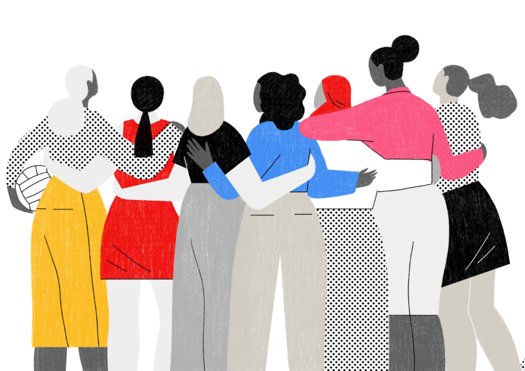
Across all platforms, EN now has a fresh look and feel, using fun tapestries and personal illustrations to embody the community feel and inclusivity that’s central to our sport.

We commissioned an illustrator from New York called Abbey Lossing to produce our very own EN illustrations.
We believe the illustrations add another layer of identity, softening images and making us more accessible.
The colours in the illustrations are from our EN colour palette, adding fun and a playful element.
The illustrations can be used alone or overlayed on imagery and they are a good way of linking brand and strategy as each destination has its own illustration.
Clothed with our new brand identity, we want to create moments, events and experiences that create a sense of belonging and give people a feeling that they are part of something much bigger than themselves.
EN’s new adventure is here, and we can’t wait to start this journey, together.