San Jose Earthquakes Unveil New Logo for 40th Anniversary
January 31, 2014
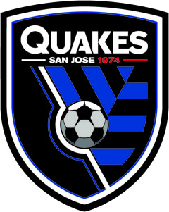
Major League Soccer side San Jose Earthquakes unveiled the club’s new logo and jerseys during their 40th Anniversary Party last night.
Over 4, viagra 100mg 000 fans were on hand for the event, health which celebrated 40 years of professional soccer in San Jose.
“This is a momentous day for the San Jose Earthquakes as we continue to shape the identity of this club to match its rich history and community ties, anesthetist ” said Earthquakes president Dave Kaval. “After consulting with fans, former players, staff and community stakeholders, we established three pillars for the club: Unity, Devotion, Heritage. Each of those pillars was integrated into the design of our new logo and will define the organization going forward.”
The Earthquakes also unveiled their new jerseys for 2014. The kits used inspiration from adidas’ 2014 World Cup kits combined with elements from the club to create an innovative look. Both jerseys feature banding across the back, adidas’ signature jersey element for the 2014 World Cup in Brazil.
The primary kit follows the club’s style from 2000-05 with a blue top, black shorts and blue socks. One of the unique features is the impact pattern from the club’s logo faded across the chest. In remembering the club’s roots, the words “San Jose 1974” are stitched inside the collar and “Established 1974” is emblazoned behind the neck on the top’s exterior.
The secondary kit will serve as the club’s 40th Anniversary uniform. The jersey pays tribute to the NASL teams and players with red tops, shorts and socks. The red kits also include the impact pattern across the chest.